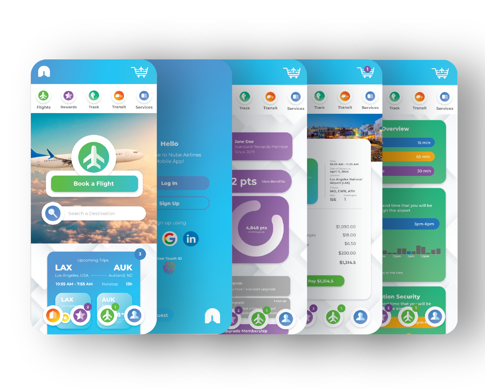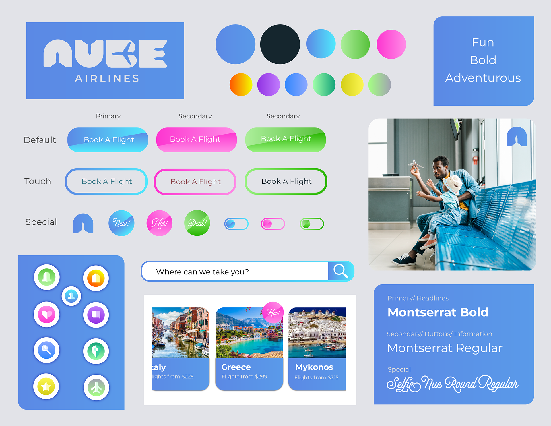
I fully embraced the app’s unique and vibrant color scheme, using it as a foundation to enhance the overall user experience. My goal was to create an interface that felt clean, modern, and intuitive while also evoking a sense of excitement and adventure for travelers. To improve usability and navigation, I implemented a color-coded system for each section within the app, ensuring users can quickly and effortlessly distinguish between different features. This strategic use of color not only adds to the app’s visual appeal but also enhances clarity, making the experience both engaging and user-friendly.